
Behind the Cover Design
As much as everyone uses the phrase "Don't judge a book by its cover," the reality is that we all do — and for good reason: a book's cover is its first chance to grab our attention, to communicate the story within its pages, to convince customers that it will be worth their time and effort to read — no pressure!
Lucky for us, we discovered Steve Leard, a phenomenal cover designer based in the UK who has a knack for working on nonfiction books. You can check out some of his other designs here.
We told Steve that we were looking for a cover that would capture the concept of our book in a simple, striking image. Maybe a picture, maybe an illustration...nothing too intricate, but then again, not necessarily a minimalist design, either. Needless to say, Steve has the patience of a saint and, talented designer that he is, came back to us with an array of brilliant designs to choose from:


As you can imagine, after receiving these options, we had some thinking to do. We were able rule out a few cover designs right off the bat, but choosing between our favorites was an agonizing process. We asked Steve for a few color options and tweaks for our frontrunners:


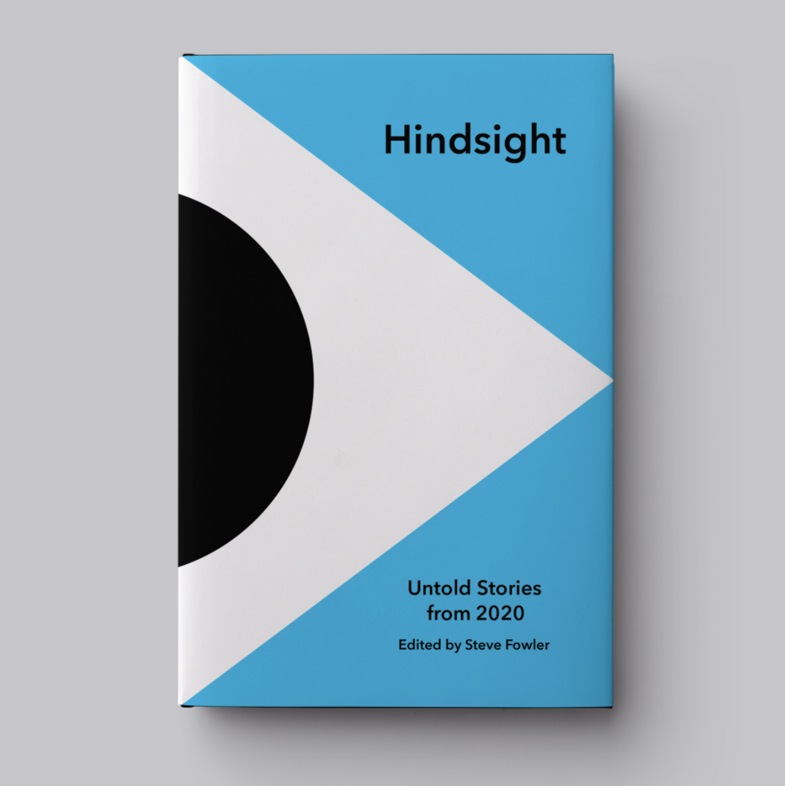
After many conversations, some artistic revisions, and just a little bit of tearing our hair out, we finally arrived at a decision. We chose the cover that we felt had a bold, clean design; an iconic image that will forever represent 2020; and an emotionally-neutral but vibrant color.
We’re quite pleased with the way it came out, and we hope you like it, too. Thanks again to Steve for bringing our vague, aspirational ideas together in one incredible book cover.